A Guide for Non-Designers to Create Stunning Websites
Hey there, fellow developers! So, you've mastered the art of coding and now you're ready to make your mark in the job market. The only problem is, you're not exactly confident about the look and feel of your portfolio. Your app functions flawlessly, but those buttons could use some pizzazz. Well, fear not! I'm here to share some practical tips on how to transform your ideas into a minimally styled design, even if you don't consider yourself a design expert.
Let's set some goals first:
Make It Look Intentional We're not striving for professional designer-level quality here. We just want users to think, "Hey, they put some thought into how this page looks."
Simplify Decision-Making Creating a simple webpage involves countless decisions. We don't want to be agonizing over design choices while coding. Let's tackle the design aspect separately.
Embrace Consistency Consistency is key. Even if your button design isn't groundbreaking, using the same styling throughout will give your page a cleaner and more polished appearance. You don't want to reinvent the wheel every time you add a button to your code. This applies to every element and section of content that appears multiple times on your page.
Enhance Accessibility A thoughtful design not only considers colours but also helps reduce accessibility issues. Let's ensure that our design doesn't introduce new barriers and keeps things user-friendly for everyone.
Now, let's dive into the process step by step:
Gaining Inspiration
If you're unsure about the look you want to achieve, browsing other websites can provide a great starting point. Just remember not to get overwhelmed by professional designs. Check out sites like Dribbble, Webdesign Inspiration, Awwwards, and Siteinspire. Keep in mind that some of these websites are mainly for designers to showcase their creativity rather than functional websites.
You can also find curated lists of inspirational developer portfolios tailored to your specific project. Here are a few examples:
Remember, the most important thing is to make your design your own! Embrace your creativity and don't be afraid to experiment. "I'm not a designer" is not an excuse when it comes to crafting a webpage that truly represents your vision. As long as you're happy with your website and users can easily navigate it, you've got yourself a great site.
Crafting the Layout
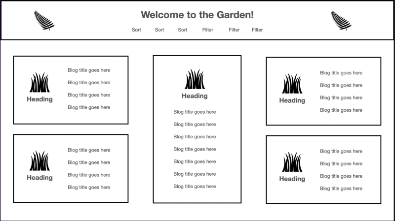
Now, let's start designing! You don't need to be a professional designer or use complicated wireframing tools. Simply open a familiar program like Google Docs or Keynote and start placing boxes on the page.

Begin by organizing your HTML structure into sections. For instance, you'll likely need a header, a footer, and a central area for your main content. Break down your content into consistent blocks. Within the main area, think in terms of a grid layout, which can be easily translated into a CSS grid. Use text size, weight, and spacing to create a visual separation between different content sections.
Adding Some Color
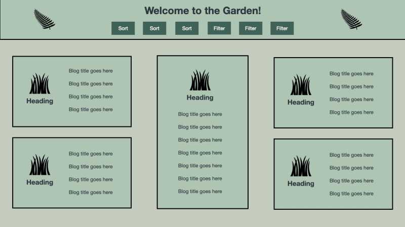
Let's bring those boxes to life by incorporating colours. Start by using grayscale for your boxes. You'll need three shades of grey: one for the background, another for the main content, and a darker shade for accents. For example, you can make the accent colour the darkest grey, which works well for buttons, making them easily noticeable. The second darkest shade can be used for the background, while the lightest grey can be the primary content colour, ideal for headers and boxes containing your content.

Next, choose three non-grey colours with sufficient contrast. Here are some handy tools to quickly generate colours with adequate contrast:
If you enjoy handpicking your colours, tools like Coolors can be paired with a contrast checker to ensure accessibility.
Remember, maintaining sufficient contrast is crucial. Low contrast can hinder text readability, while extremely high contrast (like black and white) can strain users' eyes. If you do nothing else in terms of design, using a dark grey (e.g., #333333) for text and an off-white shade (e.g., #F3F3F3) for the background is a safe bet.
The Power of Typography
Simplicity is key when it comes to typography. While people may not consciously notice if you use default fonts, they will notice if you mix and match too many. Instead, leverage different font weights, sizes, and colours within a single font family. Focus on larger, higher-contrast fonts, as they will naturally grab attention.

Choose a font family that offers various styles like italics, bold, and multiple weights. Google Fonts is a great resource that allows you to filter fonts based on the number of styles they offer.
For accessibility, opt for legible and readable fonts. Legibility considers factors such as uniform stroke weight and optimal character height and width. Characters should have fairly open counters (the negative space inside them). Readability refers to the spacing between characters on the page. Avoid using all caps or cramming text into tight spaces. Instead, use responsive font sizes that adapt to different screen sizes. This way, users can scale up the text as needed. If you want to dive deeper into the topic, check out these informative articles:
To complete your typography, choose two text colours: a darker one for light backgrounds (e.g., your main content colour) and a lighter one for dark backgrounds (e.g., your accent colour). Ensure both combinations provide sufficient contrast, and take notes on which pairings work well.

Bringing Buttons to Life
Buttons play a crucial role in guiding user actions, and we can categorize them as primary, secondary, and tertiary.
Primary buttons serve as call-to-action elements, highlighting the most important actions you want users to take. For example, a login form might have a "Submit" button.
Secondary buttons are for less crucial actions. They should still be noticeable but not as prominent as primary buttons. Think of a "Cancel" button on a login form.
Tertiary buttons cover miscellaneous actions that are less valuable to most users. They are typically styled more like links and are the least visually prominent. An example could be a "Login" button on a signup form.
You can explore the article A Trio of Buttons for a Bubbly, Colorful Site, which showcases examples of these button styles.
Leveraging the Power of Links
While buttons are used for actions, links are meant to navigate users to different sections or pages within your website. While default link styling is perfectly acceptable if you want to customize it, make sure the changes still maintain accessibility. Apply the styling to all links on the page.
In CSS, you have four link action states:
a: link(default state)a: visited(after the user has visited the link)a: hover(when the user hovers over the link)a: active(when the link is being clicked)
Make sure to define these states in your stylesheet in the order listed above to prevent them from overriding each other. To indicate a link, you can use the CSS property cursor: pointer in the a: hover selector.
Putting It All Together
Now that you have a holistic view of your web page's design, it's time to break it down into manageable components and reusable styling.
Start by identifying which boxes or sections appear multiple times on your page. Begin with a small component, such as a button, and then move on to more complex sections. For example, you can start with styling the header component, which involves applying colours, link styles, headings, and potentially buttons.
To make your styling reusable, use variables and clear naming conventions. CSS variables are great for assigning colours, and you can use names like --dark-text for your darker text color. Keep notes on the contrast between different colours in the same file for future reference. Using BEM (Block Element Modifier) class names is also helpful for organizing your styles. For instance, you can have a .button class for styles that apply to all buttons, and a .button--primary class for styles specific to primary buttons. Mozilla Developer Network offers a comprehensive guide on organizing your CSS.
By breaking down your design into reusable components, you can easily maintain and modify your styles for future features or updates. For instance, if you have a portfolio website, you can create a Project component with a heading, description, screenshot, and link. You can reuse the link styles created for the header component, and even add new button styles for a modal with a walkthrough video in the future.
In Conclusion
As someone who is a UI/UX designer, I understand how overwhelming it can be to start designing from scratch. The tips provided here aim to help you break down the design process into manageable steps so you can start building your website. Remember that a website is never truly finished, and you can always redesign, add new elements, and blog about your progress.
Keep in mind that this guide is meant to help non-designers approach the design aspect of their projects. While it may not result in professional designer-quality work, following these tips will help you create a thoughtful and visually appealing design that shows you've put effort into considering the aesthetics of your website. Most importantly, enjoy the process and be proud of what you create. Whether you're designing a modern website or going for a nostalgic '90s page, embrace your style and make your website a reflection of your creativity and personality.